Demographic Diversity on the Web
“Men are from Mars, women are from Venus,” proclaimed John Gray in his influential, yet controversial, 1992 book of the same title, which highlights differences between the sexes. This summer Irmak Sirer, Jake Hofman and I explored an online version of this issue, examining the extent to which the web experiences of, for example, men and women, and Whites and Blacks differ.[1] We started with a treasure trove of data from the Nielsen Company: complete web browsing histories for 265,000 anonymized users, together with demographic information on each individual, including their age, sex, race, educational attainment, and household income. This dataset of more than three billion site visits over the course of a year let us conduct one of the most comprehensive analyses of internet usage to date.[2]
We make three broad observations, at the level of sites, demographic groups, and individuals.
First, examining the demographic composition of the top 100,000 domains, we find numerous prominent sites with highly homogeneous audiences. For example, Fox News and Pet Finder attract millions of visitors each month, yet have audiences that are more than 90% White. Similarly, popular male-dominated destinations include the sports site Cover It Live and the adult entertainment site Need Live, while shopping site Collections Etc. tops the list of popular destinations that are more than 90% female.[3] It’s tempting to take an “everything is obvious” stance toward these results since, for example, everyone knows that sports and porn are exclusively male past-times, right? Well, perhaps surprisingly, that’s actually wrong. Many of the most popular sports sites—including Yahoo! Sports—and even porn sites have sizable female contingents of 20% or more. Moreover, we find that despite the existence of such skewed online destinations, a substantial fraction of sites have relatively diverse audiences that mirror the online population at large. In fact, comparing the homogeneity of websites to zip codes, we find that websites tend to be more racially diverse—though less gender balanced—than their offline counterparts.
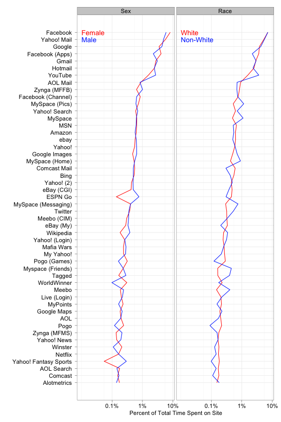
We next move from a site-centric to a group-centric analysis. The
plot below illustrates some of our findings by graphing the
fraction of time that men and women, and Whites and non-Whites,
spend on each of the top fifty sites (here’s a
version
of the plot that
Andrew prefers). On the one hand, all demographic groups spend more than a
third of their time on a handful of core email, search and social
networking sites. On the other hand, there is notable variation in
how different groups distribute their time online, both on
universally popular and on niche sites. For example, while YouTube
is heavily frequented by both sexes, men spend nearly twice as
much of their time on the site than do women. Likewise,
Etsy—a relatively niche, crafts site—ranks among the
top 100 most popular destinations for women, but is comparatively
unpopular among men.

Finally, given the substantial group-level differences, we ask whether one can reliably predict an individual’s demographics from the websites that they visit. We find that while browsing history is a reasonable indicator of education and income, it’s relatively easier to infer sex and race. (At the risk of encouraging over-interpretation, I’ll disclose that visiting Country Music Television is a strong predictor of being White, while visiting the cosmetics company Lancôme is a strong female cue.) Thus, while nearly everyone spends a lot of time on social networking sites or checking email, there are nevertheless telling browsing habits that reveal an individual’s demographic attributes.
Returning to the motivating question—how different are the online experiences of various demographic groups?—we are left with a decidedly mixed answer, apropos of this blog. Moreover, whether the variation we report is cause for alarm or simply reflects individual preferences is a complex question that we leave largely unanswered. Well, whether or not the internet is a land of rainbows that’ll help us all just get along, at least it’s really great for porn.
NB: For a more complete analysis, check out our paper. Big thanks to Mainak Mazumdar at the Nielsen Company for providing web browsing data, and to Dan Reeves, Bethany Soule and Jake Hofman for helpful comments. Thanks also to Andrew Gelman for graphics advice.
Illustration by Kelly Savage
Footnotes
[1] We actually traversed a circuitous path before settling on this research direction, a path that Jake chronicled nicely in a recent talk at TimesOpen 2.0.
[2] As a point of comparison, typical studies of web usage are survey-driven—for example, the recent studies on income disparities by the Pew Center—and are thus necessarily limited in both scale and scope.
[3] Lest you take this list as confirming stereotypes that men like sports and porn, while women like shopping, let me remind you of the prosecutor’s fallacy: That most people who engage in a certain activity are men does not imply that most men engage in that activity. In particular, even though 91% of traffic on Cover It Live is generated by men, less than 0.1% of traffic generated by men is directed toward that site.

